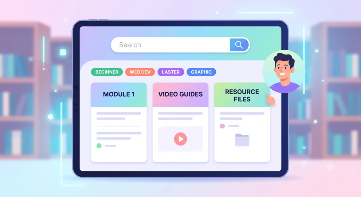
Designing Clean Educational Portals That Visitors Love
By Helpful-Site Editorial Team ·
Organizing Content Around User Goals, Not Site Structure
The most common mistake in building educational resource hubs is organizing content to reflect the way the organization thinks about it rather than the way users look for it. A library of technical guides organized by department, content type, or publication date requires users to understand the site's internal logic before they can find anything. A library organized by task — what someone is trying to accomplish — meets users where they are.
Before deciding on a navigation structure or content taxonomy, list the ten most common reasons a visitor arrives at your resource hub. Each reason is a potential category in your information architecture. If the list includes 'how to get started', 'how to do task X', 'how to troubleshoot problem Y', and 'how to compare options Z', those are your categories — not 'tutorials', 'documentation', 'blog posts', and 'FAQ'.
Search, Filtering, and Navigation Best Practices
Search is the most important navigation tool for resource-heavy sites. A user who knows what they are looking for should be able to type a phrase and reach the relevant content within two clicks. Search on educational portals fails most often not because the content is absent but because the indexing does not match how users phrase their queries. Improving search often requires tagging content with the terms users actually type, which may differ significantly from the language used in the content itself.
Filtering complements search by helping users who know the general category they want but not the specific item. Topic tags, difficulty levels, content type (guide, tutorial, reference, example), and estimated reading time are all filtering dimensions that help users narrow a large collection to the relevant subset without browsing the entire archive.
Breadcrumb navigation serves two purposes: it shows users where they are in the information hierarchy, and it gives them a one-click path back to the parent category when they want to explore adjacent content. Educational portals with clear breadcrumbs consistently show higher content discovery metrics than those without, because users who finish one article can easily surface others in the same area.
Content Quality Over Content Volume
A common impulse in building a resource hub is to publish as much content as possible on the theory that more coverage is better. In practice, a library of thin, superficial articles performs worse in search and earns less reader trust than a smaller collection of thorough, well-structured guides. Search engines have become increasingly effective at identifying content that covers a topic in genuine depth versus content that mentions the topic without explaining it.
Quality signals that readers and search engines both respond to include: multiple subsections with descriptive headings, concrete examples with specific numbers or steps, internal links to related tools and guides, and enough length to actually explain the topic rather than just introduce it. A guide that takes three minutes to read and leaves readers with actionable knowledge outperforms ten guides that each take thirty seconds and leave readers with unanswered questions.
Visual Design for Readability and Return Visits
Educational content benefits more than almost any other content type from typography that prioritizes readability. Line lengths between 60 and 75 characters per line are optimal for sustained reading. Longer lines require readers to work harder to track from the end of one line to the beginning of the next. Shorter lines interrupt reading rhythm with excessive line breaks. Setting a maximum content width that produces comfortable line lengths is one of the most impactful readability improvements available.
A consistent visual treatment across all guide pages — same header structure, same font hierarchy, same spacing conventions — trains returning visitors to navigate new content instantly. When every guide looks different, users spend cognitive resources orienting themselves on each new page. When every guide looks the same, they can focus entirely on the content.
Related content links placed at the end of each guide, pointing to two or three genuinely relevant articles in the same area, reduce the exit rate from the resource hub and increase the number of articles each visitor reads in a session. The links should reflect actual topical relevance, not just recent publication date or editorial promotion.
More practical guidance for this topic(expand)
Evaluate an educational portal with real learner tasks
A clean interface is not simply a page with fewer colours. Learners need to understand where they are, what they can do next, and whether an action has been saved. Test a portal by asking someone unfamiliar with it to find a lesson, resume a course, submit an assignment, and locate feedback. Observe where they pause or choose the wrong control. Those moments reveal navigation and wording problems more reliably than a design review that only checks visual consistency.
Organise navigation around the language learners already use: courses, lessons, assignments, feedback, and support. Keep the current course and progress visible without making every page compete for attention. Important states need more than colour alone; pair status colours with clear labels or icons, and make error messages explain how to recover. On smaller screens, verify that menus, lesson controls, and forms remain usable without horizontal scrolling or precise pointer movement.
Accessibility and performance affect whether the content can be used at all. Check keyboard navigation, focus order, contrast, image alternatives, captions, and form labels. Test pages on a slower connection and with a modest device, especially where lessons contain video or interactive material. A portal should also preserve progress when a learner changes pages or signs in on another device if that behaviour is promised. Confirm the save state rather than assuming a button click worked.
- Run task-based checks with learners who did not help design the interface.
- Make progress, deadlines, feedback, and recovery instructions understandable without colour alone.
- Test the core lesson path on a keyboard, a phone-sized viewport, and a slower connection.
Related guides
Continue with practical advice related to this topic.