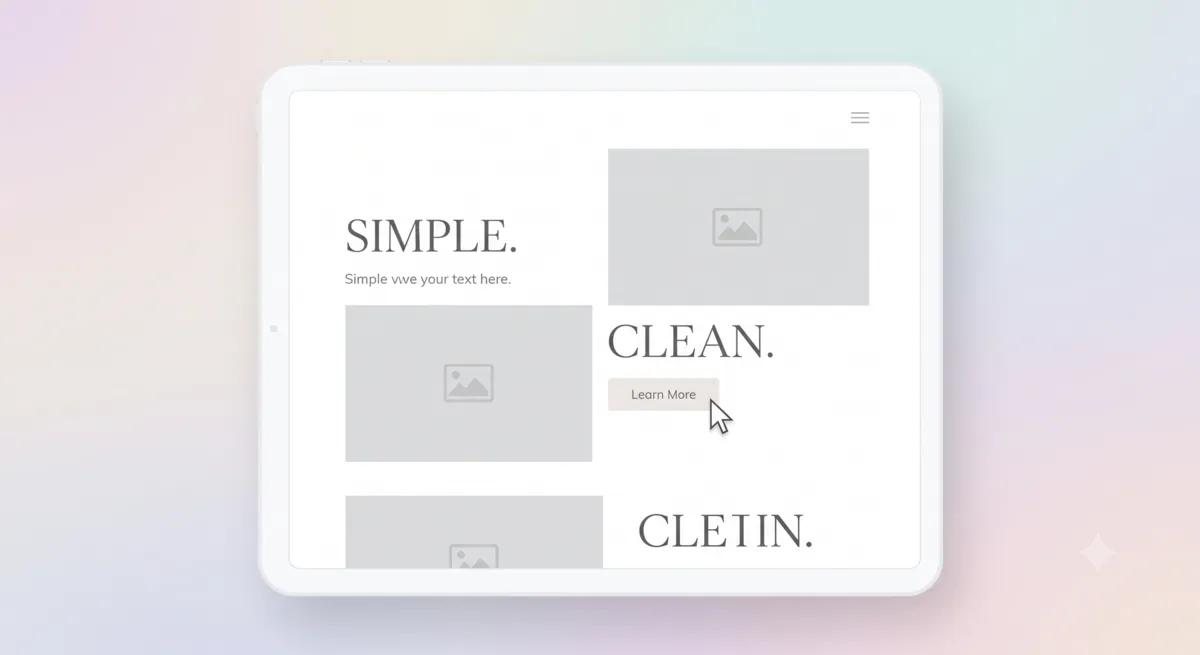
The Perfect Blueprint for Minimalist Interface Design
By Helpful-Site Editorial Team ·
The Core Principle: Remove, Don't Add
Minimalist interface design is not about making things look sparse or empty. It is about identifying every element that exists on a screen and asking whether each one helps the user accomplish their goal. Elements that do not contribute directly to the primary task are candidates for removal, regardless of how attractive they are or how much work went into creating them.
This principle runs against the natural instinct of most builders, who tend to add features and visual elements over time without a corresponding discipline of removal. The result is interfaces that accumulate complexity — a sidebar that started with three items now has twelve, a form that originally had five fields now has nine, a homepage that once communicated one clear idea now tries to communicate seven at once. Each addition was individually justified, but the cumulative effect is a page that overwhelms rather than guides.
White Space as a Design Element
White space — the empty area between and around design elements — is not wasted space. It is an active design tool that guides attention, creates visual hierarchy, and gives content room to breathe. Pages with generous white space around headings and body text consistently outperform dense, packed layouts on readability and comprehension metrics.
The practical implementation is straightforward: increase the padding around major content blocks, add more vertical space between sections, and resist the urge to fill empty areas with decorative elements. If a page feels too empty after removing clutter, the correct response is usually not to add something back — it is to improve the quality of what remains so it earns the available space.
Typography also benefits from white space. Line height set at 1.5 to 1.75 times the font size is significantly easier to read than tightly packed lines. Letter spacing that is slightly more generous than the default improves readability at small sizes. These adjustments take minutes to implement and measurably improve how long visitors spend reading rather than scanning.
Typography Hierarchy and Navigation Clarity
A clear typographic hierarchy communicates page structure without requiring the user to think about it. Headings should be visually distinct from body text, subheadings should be visually distinct from main headings, and supporting text like captions or labels should be visually subordinate to the content they describe. When all text is the same size and weight, readers have no visual shortcut for orienting themselves on the page.
Navigation should present only the choices that are genuinely useful to the majority of visitors. Every additional navigation item dilutes the prominence of the others. A primary navigation with four clearly labeled items performs better than one with twelve items, because users can scan and choose faster when the option space is smaller. Items that serve only edge-case needs belong in secondary navigation, footers, or help sections rather than the primary menu.
Applying Minimalism to Utility Interfaces
Tool interfaces benefit most directly from minimalist principles. A utility page has one job: accept an input and produce an output. Every element present on that page should serve either the input collection, the output display, or navigation to related tools. Anything else — decorative headers, tangential links, social sharing buttons, newsletter prompts — competes with the primary task and should be cut or moved.
The best-performing utility interfaces on the web share a common pattern: a single prominent input field or zone, a clear action button, and a visible output area. Users who arrive with a specific task in mind should be able to start working within two seconds of the page loading. Any interface that requires more than that — reading instructions, locating the input field, dismissing a prompt — is adding friction to a task that users could complete elsewhere.
Testing the minimalism of your own interface is simple: give someone unfamiliar with the tool ten seconds to describe what it does and how to use it. If they cannot answer both questions confidently, the interface has more communicating to do. The fix is almost always removing something rather than adding an explanation.
More practical guidance for this topic(expand)
Remove visual noise without removing useful cues
Minimalism is successful when the important action becomes easier to find, not when a page simply contains fewer elements. List the user’s main tasks and keep the controls, labels, and status information needed to complete them. Remove repetition only after confirming the remaining element still makes sense on its own. A button with an icon but no text may look clean yet become ambiguous to a new visitor or inaccessible to someone using assistive technology.
Use spacing, alignment, type size, and contrast to show hierarchy consistently. A small number of styles can make a page feel calm, but body text still needs comfortable line length and readable contrast. Test error, loading, empty, success, and disabled states; a minimal default screen can become confusing when something goes wrong. Keep feedback close to the action that caused it, and explain how to recover rather than showing a colour change alone.
Evaluate the design with realistic tasks on different screen sizes. Ask a person unfamiliar with the interface to complete a common action without coaching, then note hesitations and mistaken taps. Check keyboard focus and screen-reader labels as well as visual appearance. A reduction in decoration is useful only if it preserves orientation, accessibility, and confidence. Make one change at a time and verify that the task is still discoverable before removing another cue.
- Keep labels and status messages that help someone complete or recover from a task.
- Check contrast, keyboard focus, error states, and mobile layouts before removing cues.
- Use task-based observation to test whether a simplified screen is actually clearer.
Make the visual hierarchy usable without sight or a mouse
A quiet interface still needs a clear reading order. Use headings in a meaningful sequence, associate labels with their controls, and make keyboard focus visible while someone moves through the page. A selected tab, warning, or completed task should have a text label or other cue as well as colour. These choices preserve the hierarchy for people using assistive technology, high zoom, a small screen, or a display where colour is difficult to distinguish.
Check contrast using the actual text size and background, then test the complete component rather than only its design token. Focus rings, disabled controls, placeholders, and validation messages can become difficult to see even when the main text passes. WCAG provides testable contrast and keyboard criteria, but passing one criterion does not prove that the interface is easy to use. Pair standards checks with a task-based review and let people recover from mistakes without starting over.
- Preserve headings, labels, keyboard focus, and text status when reducing decoration.
- Measure contrast for the actual foreground, background, and text size.
- Test errors and recovery as carefully as the default screen.
References
Related guides
Continue with practical advice related to this topic.